
Using Color Psychology to Enhance Your Branding
- Vinod Kumar Dubey
- 20 hours ago
- 4 min read

Choosing the right colors for your brand is more than just picking what looks good. Colors influence how people feel and think about your business. This is where color psychology comes in. It helps you understand how different colors affect emotions and behaviours. Using this knowledge can make your branding more effective and memorable.
Understanding Branding with Color Psychology
Colors send messages without words. They can attract attention, create moods, and even influence buying decisions. For example, red can evoke excitement and urgency, while blue often feels calm and trustworthy. When you use colors strategically, you can shape how customers perceive your brand.
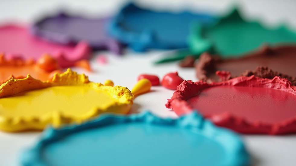
Here are some common color meanings to consider:
Red: Energy, passion, urgency
Blue: Trust, calm, professionalism
Green: Growth, health, nature
Yellow: Optimism, warmth, clarity
Orange: Creativity, enthusiasm, friendliness
Purple: Luxury, wisdom, spirituality
Black: Sophistication, power, elegance
White: Simplicity, purity, cleanliness
Knowing these associations helps you pick colors that match your brand’s personality and goals. For example, a health food brand might use green to highlight natural ingredients, while a tech company might choose blue to build trust.
How to Apply Color Psychology in Your Branding
Applying color psychology to branding involves more than just the logo. It includes your website, packaging, advertising, and even office design. Here are practical steps to get started:
Define Your Brand Personality
Identify the traits you want your brand to express. Is it playful, serious, luxurious, or eco-friendly? Your colors should reflect these qualities.
Research Your Audience
Different cultures and demographics respond to colors differently. For example, white is associated with purity in many Western cultures but can signify mourning in some Eastern cultures. Tailor your palette to your target market.
Choose a Primary Color
This will be the main color representing your brand. It should align with your brand personality and appeal to your audience.
Select Complementary Colors
Use 2-3 additional colors that work well with your primary color. These can be used for accents, backgrounds, and calls to action.
Test Your Palette
Try your colors in different contexts to see how they look on screens, print, and products. Make sure they maintain consistency and readability.
Be Consistent
Use your chosen colors consistently across all brand materials to build recognition and trust.
For example, a financial services company might use a deep blue as the primary color to convey trust and stability, with grey and white as complementary colors for a clean, professional look.

The Science Behind Color Psychology Branding
The impact of color on human psychology is backed by research. Colors can affect mood, memory, and even physiological responses like heart rate. This makes color a powerful tool in marketing and branding.
Studies show that people make subconscious judgments about products within 90 seconds of initial viewing, and up to 90% of that assessment is based on color alone. This means your color choices can influence whether someone feels attracted to your brand or not.
Moreover, colors can trigger specific emotions:
Red increases heart rate and creates urgency, useful for sales and promotions.
Blue lowers blood pressure and creates a sense of calm, ideal for healthcare and finance.
Yellow stimulates mental activity and optimism, great for creative industries.
Understanding these effects helps you design branding that connects emotionally with your audience.

Tips for Choosing Colors That Work for Your Brand
Choosing the right colors can be challenging. Here are some actionable tips to guide you:
Keep it Simple: Limit your palette to 2-4 colors to avoid confusion.
Consider Contrast: Ensure text and backgrounds have enough contrast for readability.
Use Color Psychology Branding Resources: Explore expert insights and tools like color psychology branding to make informed decisions.
Think About Longevity: Choose colors that will age well and remain relevant as your brand grows.
Test with Real Users: Gather feedback from your target audience to see how they respond to your colors.
Adapt for Different Mediums: Colors may look different on print, digital, and physical products. Adjust accordingly.
For example, a startup targeting young adults might use vibrant orange and yellow to appear energetic and approachable, while a luxury brand might opt for black and gold to convey exclusivity.
Enhancing Brand Recognition Through Color
Consistent use of color helps customers instantly recognize your brand. Think of iconic brands like Coca-Cola’s red or Tiffany & Co.’s robin egg blue. These colors become part of the brand identity and create strong emotional connections.
To enhance brand recognition:
Use your primary color in your logo, website, and packaging.
Incorporate your color palette in social media posts and advertisements.
Train your team to use brand colors correctly in all communications.
Refresh your palette carefully if you rebrand, keeping some elements consistent.
By doing this, you build trust and loyalty, making your brand memorable in a crowded market.
Using color psychology in branding is a smart way to connect with your audience on a deeper level. By understanding the emotions colors evoke and applying them thoughtfully, you can create a brand identity that stands out and resonates. Whether you are launching a new brand or refreshing an existing one, consider how your color choices reflect your values and appeal to your customers. This strategic approach will help you build a strong, lasting brand presence.


Comments